
For Newcastle businesses
Logo design
in Newcastle.
A recognisable logo, with the right versions for the places your business appears.
Tell us about your business and what you need.


Logo design at spareday
A logo needs to work beyond the first preview.
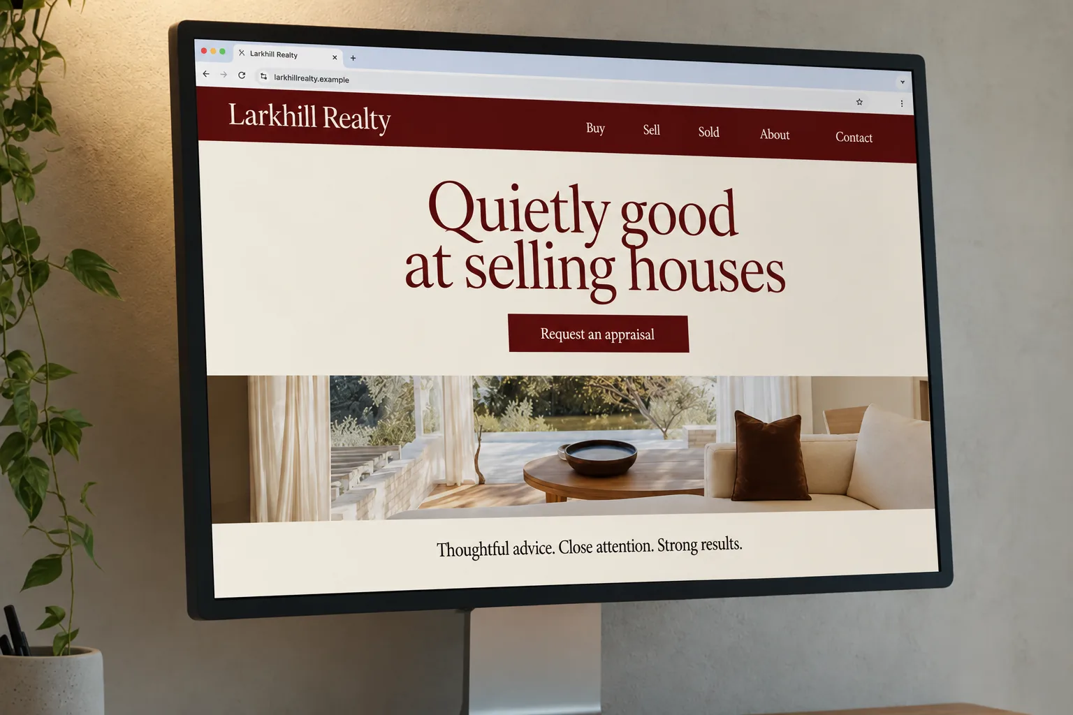
Your logo may appear large on a sign, small on a business card and inside a square social profile. The design and its variations need to suit those uses while staying recognisable.
spareday provides logo design in Newcastle for new businesses and owners ready to update an existing mark. Reece works with you on the visual direction, the places the logo will appear and the files needed to use it.
What’s included
The mark and the versions you need.
We agree the intended uses before designing. A logo that needs to appear on a shirt, a shopfront and a website needs those requirements considered together.
- A clear visual direction
- A proposed design based on your business, its customers and the examples you bring to the brief.
- Practical variations
- The agreed full, compact, light-background and dark-background versions, checked where they will actually appear.
- Colour and type references
- The chosen colours and typefaces recorded so the logo can sit consistently with the rest of your materials.
- Files for their intended use
- Scalable artwork for larger uses and image formats for everyday use on screens, as agreed in the brief.
How it works
Review the direction before the final files.
Bring the current logo if you have one, a few designs you like and a list of where the new logo needs to go. Include any printer or sign supplier’s requirements.
- Set the brief
- We discuss what the business does, the style that suits it and whether to develop a new mark or refine the current one.
- Choose a direction
- You review the proposed design direction with the decision-makers in your business.
- Refine and check
- We work through the agreed feedback and check the design at the sizes and on the backgrounds named in the brief.
- Prepare the handover
- The approved logo is supplied in the agreed versions and formats, with the colour references and usage details.
Where it will appear
Plan for the small spaces as well as the large ones.
A long business name may need a compact version for a social profile. Fine detail can become hard to see when reduced. Reviewing the logo at its intended size helps settle those choices before the files are finished.
For signage and vehicle wraps, a vector file contains shapes that can scale without becoming pixelated. A printer may also need particular colours or file settings. Bring those specifications into the brief.
The rest of your identity
Carry the design into your everyday materials.
Your logo sits alongside words, photos and layouts. Keeping those choices consistent helps your website, quote and business card feel like the same business.
If you need more than the mark itself, we can discuss the wider graphic design work with it. A larger change to the identity has its own scope; the guide to rebrand costs explains the work involved.
From clients
What clients say about working with spareday
“He was able to take our rough ideas, from concept through to reality. The site has provided an influx of new members, helping to keep our club viable.”
“He didn’t just build me a great website, he created an easy-to-manage system that allows me to make updates myself whenever I need to. He has spared me so much time doing all of this myself!”
“Huge shoutout to Reece for building my website for Hughesys Painting Services. Since it went live my phone hasn’t stopped ringing.”

“He created a stunning website for us that captures and nurtures leads with an automated email marketing system, which has filled a huge gap in the business and saved a lot of time (and money!).”
Official guidance
Before you settle on a logo, read IP Australia on trade marks and the Attorney-General’s Department on copyright.
A few practical details
Before we get started.
Can you update the logo we already have?
Yes. Send the existing files and explain what needs to change. We’ll discuss whether refining the current design or developing a new one suits the job.
Which files will we receive?
We agree the file list against the planned uses. That can include scalable artwork, image versions for your website and social profiles, and light, dark or single-colour variations.
How many design changes are included?
The quote sets out the design and revision scope before work starts. Gather feedback from everyone involved into a clear set of notes so each review has a settled direction.
Who owns the logo and can another designer use it?
Ownership, supplied files and any font or image licences are confirmed in the agreement. Tell us if another designer, printer or sign supplier will need to work with the files.
What do you need to quote the job?
Your business name, what you do, any existing logo, a few visual references and where the logo will be used. Include a launch or print deadline so the quote can account for it.
Who you’ll work with
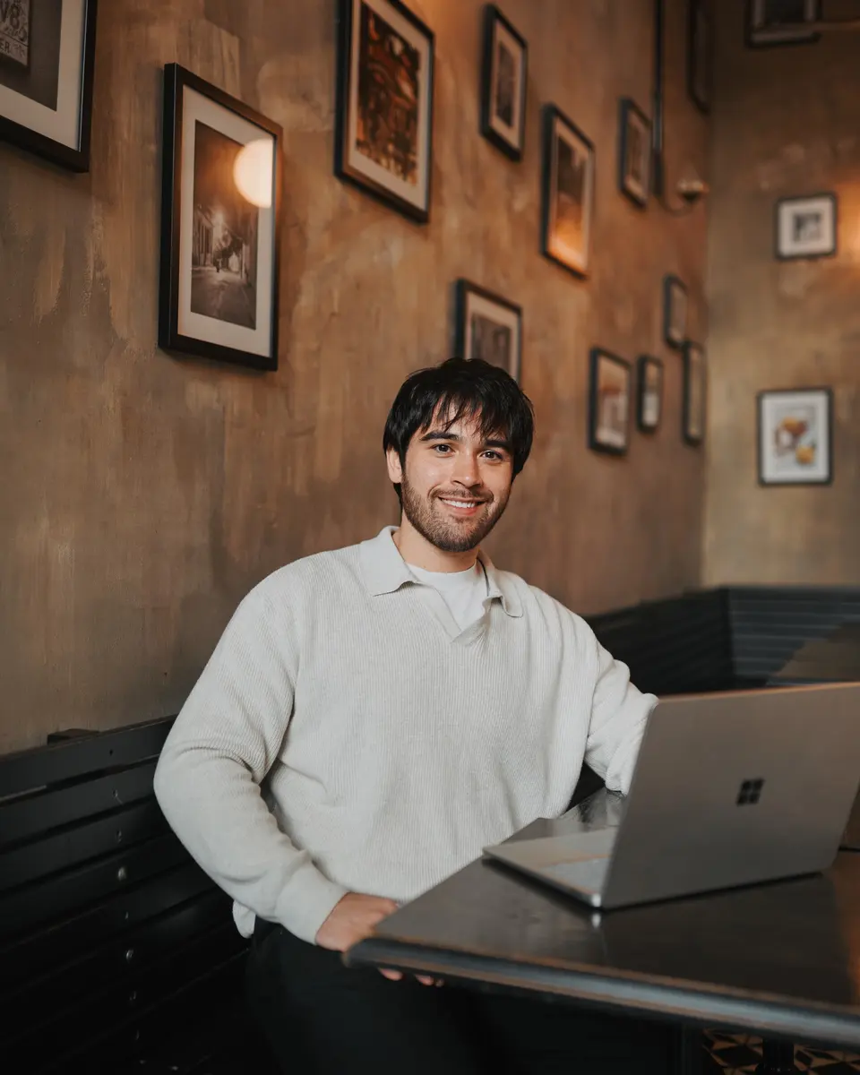
Hi, I’m Reece.
I’m Reece, the person behind spareday in Newcastle. I’ll help you work through the logo direction and how it fits with the website and materials your customers see.

Find us
spareday in Newcastle.
12 Grey Street, Wickham, Newcastle NSW 2293.
Your business logo
Tell us where your logo needs to work.
Share your current design or the idea for your new business. We’ll discuss the brief, the files you need and a quote.
Or call 0485 017 387.