
For Newcastle businesses
Business card design
in Newcastle.
A clear, considered card that makes it easy to remember your business and get in touch.
Tell us about your business and what you need.


Business cards at spareday
Make the details easy to find.
A business card gives someone a useful reminder after a conversation. Your name, what you do and the best way to reach you need to be readable at the size of the finished card.
spareday provides business card design in Newcastle, using your existing identity or developing it alongside a new logo. The layout and artwork are prepared around the card size, printing requirements and contact details agreed in the brief.
What’s included
From your details to artwork for the printer.
Bring the printer’s specifications if you already have a supplier. They set the card size and the file requirements, so the design is prepared for the product you intend to order.
- A layout that suits your business
- Your logo, colours and type brought into a card with a clear reading order.
- The right contact details
- The name, role, phone, email or website you choose, arranged around how customers should contact you.
- Front and back design
- The agreed sides and staff variations, with a common layout across the set.
- Artwork prepared for print
- Files set up to the supplier’s specifications, including any extra artwork beyond the cut edge, called bleed.
- A design proof to approve
- A preview for checking the layout and details before you authorise the printing.
How it works
Check the card at the size people will hold.
A card can look much larger on a screen than it does in a hand. The layout needs to be checked at its finished size, especially the small contact text.
- Collect the brand files
- Send your logo, colours, typefaces and the exact details for each person who needs a card.
- Agree the print requirements
- Confirm the size, sides, stock, finish and quantity with the print supplier. Mention the date you need the cards in hand.
- Review the design
- Check the layout at actual size and review the spelling, website and every digit of the phone number.
- Approve the final artwork
- Once the details are signed off, the files are prepared for the agreed printing specification.
Stock and finish
Choose the card around how you will use it.
The paper stock and finish affect how a card feels. If you want to write appointment times or a note on it, ask the printer for a suitable writable stock and a sample. Screen previews show the layout; a physical sample lets you judge the material.
Allow for artwork approval, printing and delivery when planning for an event. Each has its own timing. Printing, special finishes and delivery need to be identified in the quote so the design and production costs are clear.
Matching your other materials
Use the same identity wherever customers meet you.
The card can use the same colours and type as your website, quotes and other graphic design. If the logo needs work first, the logo design scope is part of that conversation.
A scalable logo file is useful across print sizes. For a wider rollout, check the file requirements for signs and vehicle wraps with those suppliers as well. It helps to gather each specification before preparing the final set.
From clients
What clients say about working with spareday
“He was able to take our rough ideas, from concept through to reality. The site has provided an influx of new members, helping to keep our club viable.”

“He created a stunning website for us that captures and nurtures leads with an automated email marketing system, which has filled a huge gap in the business and saved a lot of time (and money!).”

“He didn’t just build me a great website, he created an easy-to-manage system that allows me to make updates myself whenever I need to. He has spared me so much time doing all of this myself!”

“Huge shoutout to Reece for building my website for Hughesys Painting Services. Since it went live my phone hasn’t stopped ringing.”
Official guidance
For independent background, read the official guidance on trade marks and intellectual property.
A few practical details
Before we get started.
Can you use our existing logo?
Yes. Send the best logo files you have, along with any brand guide. If the file needs recreating or the design needs changing, we’ll discuss that work before the card is prepared.
Is printing included?
Printing and delivery are confirmed separately in the quote. Tell us whether you have a printer already, the quantity you need and any preferred stock or finish.
Can you make cards for several staff members?
Yes. Provide the exact name, role and contact details for each person. We’ll include the required variations in the scope and use a consistent design across them.
Can I add a QR code?
A QR code can link to your website, booking page or contact details. Tell us the destination and check the code on a phone using a printed sample at the intended size before approving the run.
What do you need for a quote?
Your logo, the details to print, the number of staff versions and any printer specifications. Mention the quantity and event date if relevant, so design, printing and delivery can be discussed together.

Who you’ll work with
Hi, I’m Reece.
I’m Reece, based in Newcastle. I’ll work through the design and the details with you, so your card feels consistent with the other things your business puts in front of customers.



Find us
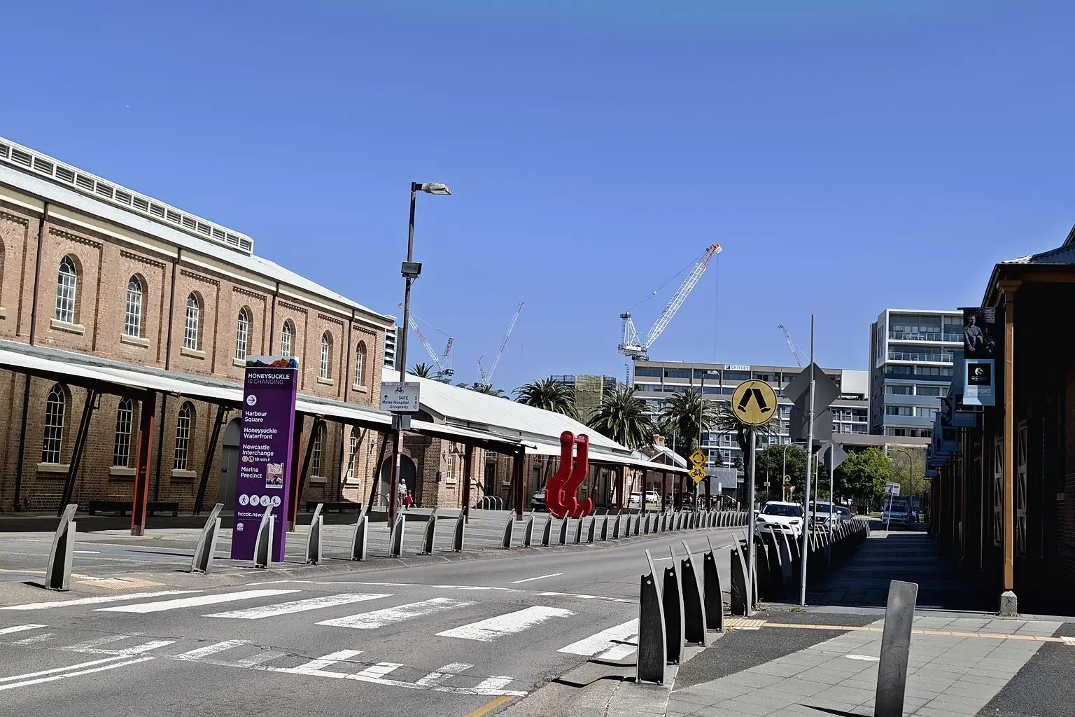
spareday in Newcastle.
12 Grey Street, Wickham, Newcastle NSW 2293.
Your next business card
Put a clear design in your customers’ hands.
Tell us what you need printed and when you plan to use it. We’ll discuss the card design and put together a free growth plan, price included.
Or call 0485 017 387.