
For tradies paying for a site nobody can load
The three things it has to do, and everything you are paying for that it does not.
A report on your own website, showing what it loads in on a phone and what a customer sees in the first screen.
 By Reece Rainer
spareday, Newcastle NSW
Last updated
13 September 2026
Read time
5 minutes
By Reece Rainer
spareday, Newcastle NSW
Last updated
13 September 2026
Read time
5 minutes
He was able to take our rough ideas, from concept through to reality. The site has provided an influx of new members, helping to keep our club viable.
A passion-driven, good-hearted and reliable service provider with the competency of a genius when it comes to software engineering, AI technology and marketing.
He created a stunning website for us that captures and nurtures leads with an automated email marketing system, which has filled a huge gap in the business and saved a lot of time (and money!).
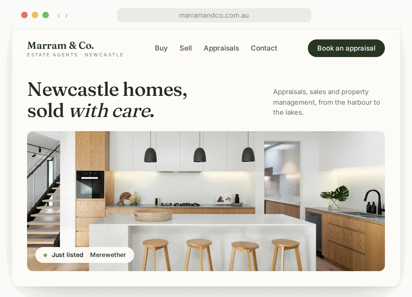
Most tradies are sold a website that looks like an agency's portfolio piece and does none of the three things a tradie actually needs a website to do.
This is what those three things are, what a trade website can safely leave out, and how to tell whether the one you have is working.
Prove you are real and licensed, make it obvious what work you take and where, and make ringing you take one tap. Everything else on a trade website is decoration, and most of it is slowing the page down.
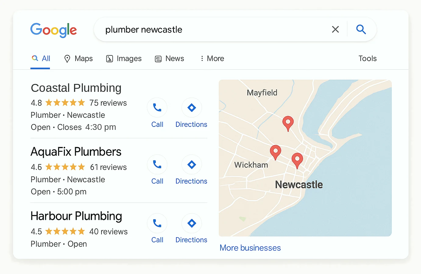
The person landing on it is not browsing. They found you on a map or somebody gave them your name, and they are checking whether you look like a real business before they call.
That check takes under fifteen seconds and it is mostly visual. Is there a licence number, are there photographs of actual jobs, does the phone number work on a phone, does it say which suburbs.
Everything a trade website gets sold beyond that, the sliders, the animated statistics, the stock photograph of a smiling man in a hard hat, is being paid for and is doing nothing.
The overwhelming majority of traffic to a trade website arrives on a phone, often outdoors, often on a poor connection. A site that was designed on a large screen and checked on a large screen fails all three of those.
The failures are consistent and easy to find. A hero image that takes six seconds to load, a phone number that is an image rather than a link, a menu that needs two taps to find anything, and text at a size nobody can read in sunlight.
Speed is the one that costs the most and is discussed the least. A trade site loading in six seconds loses a meaningful share of the people who tapped it, and they go back to the map and ring the next business.
A gallery of jobs you actually did is the most persuasive thing a trade website can contain, and it is the thing most trade websites replace with stock imagery of somebody else's tools.
The reason is simple enough. A customer cannot judge trade work, so they judge the evidence that you have done it before, repeatedly, in houses that look like theirs.
Photographs taken on a phone at the end of a job are better for this than professional photography, because they look like real jobs rather than like a brochure. The bar is that they are in focus and in daylight.
A page for each service you want work from, a page for each suburb that genuinely matters, an about page with the licence and the faces, and a way to get in touch. That is the whole site, and it is a small one.
Hiring a web designer and hiring somebody who understands how a trade gets found are two different purchases, and they get confused often.
The suburb pages are where money gets wasted. Twenty pages with a suburb name swapped into the same paragraphs is the exact thing search engines are built to discount, and it can hold a whole site back.
Five suburbs, each with a page that says something true about working in that suburb, will out-perform thirty copies. This is the point where most trade website packages quietly go wrong.
If you do one thing after reading this, open your own website on your phone, on mobile data, and time how long it takes before you can tap your own number. If that is over three seconds, that is what every customer is experiencing.
Related reading from us: web design for accountants and written for a nervous reader.
Usually under a dozen. One per service you want work from, a handful of real suburb pages, an about page and a contact page.
Only if each one is real. Copies with the name swapped do nothing and can hold the whole site back.
No. Phone photographs of your own finished jobs, in daylight and in focus, work better than stock imagery ever will.
Paying for a site that looks impressive on a laptop and takes six seconds to load on a phone, which is where nearly all the traffic is.